Design for Employee Resource Planning
Product Description
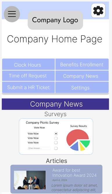
The employee resource planning app centralizes workforce management by providing HR ticketing for incidents, time tracking, a benefits portal, alerts for late clock-ins and overtime, company announcements, and resource planning tools for employers.
Design Stack
Figma
Lookback
Moodle
Miro
Unsplash
Unbounce
Emplortal
System for employees to clock in, check vacation time
Product Type
Employee Resource Planning
Key Features
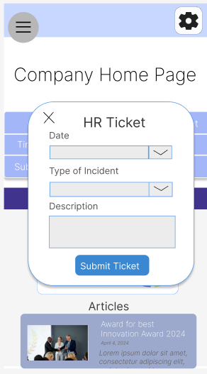
HR Tickets for Incidents & Accidents
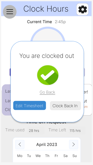
Clock Hours
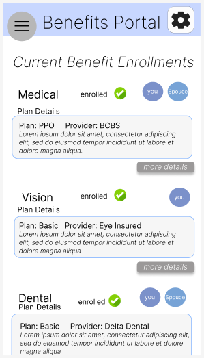
Benefits Portal
Notifications for Late Clock In/ Overtime
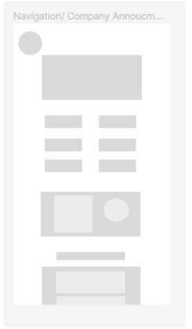
Company Announcements
Resource planning for Employers
Ideations and User Research
User Research findings created a platform and direction of developing the employee portal app product. The use of affinity mapping and feature prioritization assisted in the organization of feature ideas and key insights.

Affinity Mapping
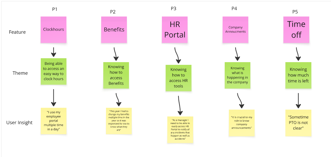
Feature Prioritization
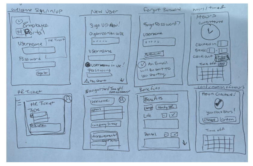
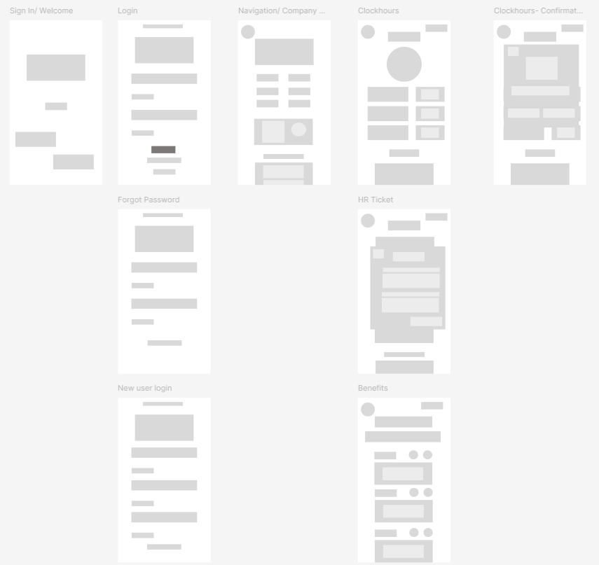
Design Sketch
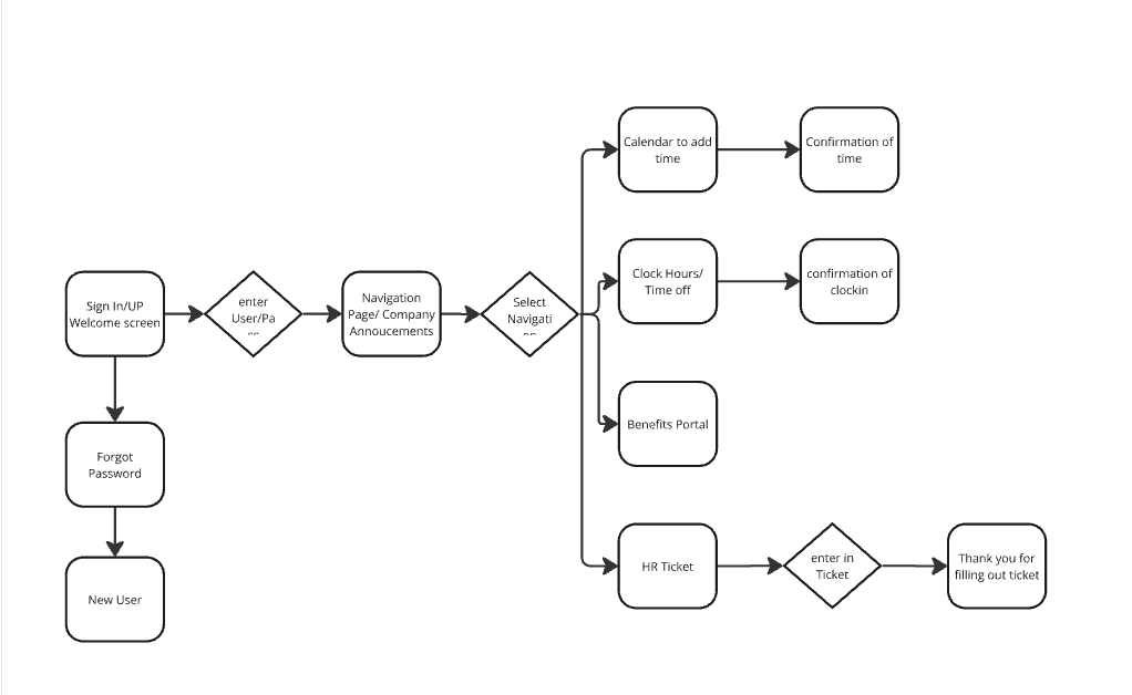
User Design Flow
Design Principles
Enhancing visual clarity and user comprehension by refining how related elements are grouped and balanced, making interfaces more intuitive and aesthetically cohesive.
Design principle proximity was used for the buttons with similar functionality - all similar buttons are placed closer together
Design Principle symmetry is used for the clock in feature to let user be aware of the options that will help them see different sides of the same feature
Lofi
Quickly explore ideas, gather early feedback, and iterate on layout and functionality without getting distracted by visual details.
Low Fidelity Digital Prototype
Metrics Met
-
Created a website to ensure customers could easily clock their hours, view their benefits, and understand any company announcements with a user flow that supports of these features.
-
Increase user’s ability to clock in/out on time- Overall increasing this tasks success rate
-
According to research lead by Quickbooks, 80% of employees needed to ultimately fix their timesheets because they miss their clock/in time
-
Accessibility Additions are to assist people with trouble distinguishing color contrast. Creating a design that optimizes the experience for people with slight to more severe color blindness creates a more interactive and inclusive experience that reduces eye strain and headaches for frequent users.
A/B Testing & Validation Testing
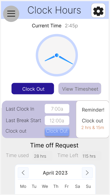
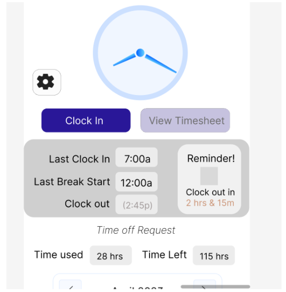
Before:
This A/B Testing was to determine if users would better know when to clock- out in result of the changes made to create screen B.
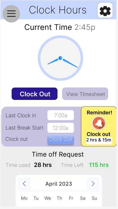
After:
Brighter colors, imagery, and contrast to the timer to create a sense of urgency for the user. Key color tones such as bold red, yellow, green tones gives the user visual clues of how much time they have remaining. Increasing the size of the primary button to clock out also allows the user a better understanding of the primary function of this Page
A/B testing was used to measure results of the design change - Resulting in 66% of more users clicking on the Clock Out button opposed to other buttons first
Adding Accessibility
This accessibility iteration was to overall increase the perceptiveness of the menu items. The color contrast within the first menu was too indistinguishable since the colors were too close in contrast for all users to be able to perceive the menu options as best as they could. The Semi-bold font choice along with the more dynamic contrast between the text color and the background color increase the ability to understand the text from a further distance.
-
Some users found difficulty seeing the navigation- losing the ability to access key functional parts to the product
-
Deeper Contrast between background and text was added as well a more bold text type
Hi Fi and Clickable Prototyping
As a final solution a clickable high fidelity prototype of the HR portal app was design and with the use of Zeplin, an engineering design handoff was created to kick start the coding process.


Style Guide
-
Color theme enhances visual consistency, reinforces brand identity, and improves usability by guiding user attention and supporting accessibility.
-
helps establish a clear visual hierarchy, enhances readability, and reinforces the brand’s tone and personality.
-
Enhances readability, reduces cognitive load, improves touch accuracy, supports responsive design, clarifies content relationships, and boosts overall accessibility and visual appeal.